
Start with the finishes that are staying
The most useful starting point for a white paint scheme is the room you already own. List the flooring, kitchen cabinetry, benchtop, tiles and large furniture that will remain. These occupy more of your view than a small colour card and can influence how a wall colour appears beside them. Put physical samples together if you have them. Where a surface cannot be moved, take the paint sample to it. A photograph can help you keep records, but camera processing and screen settings make it a poor final colour reference.
Separate fixed choices from changeable ones. If the floor will be replaced, decide whether its selection should happen before the wall colour is approved. If only cushions may change, avoid redesigning the entire paint scheme around one cushion you do not intend to keep. In a Pakenham kitchen and living area, a white that looks comfortable beside the sofa may look different beside the kitchen doors. That is a reason to test at both locations, not a reason to label the colour universally wrong. Write down which junction matters most to you, such as the wall beside the stone benchtop or the hallway frame against existing carpet.
Observe the light before collecting more samples
Watch the room at the times you actually use it. Note where daylight enters, whether an eave or neighbouring structure shades the windows, and whether the room is mainly used with lamps on. A compass direction is useful context, but it does not describe the whole light environment. Glazing, curtains, trees and adjacent surfaces all affect what reaches the wall. Avoid a universal rule that every south-facing room needs the same white or that a north-facing room will always be bright. The actual room gives better evidence than a suburb label.
Keep a short observation sheet for morning, afternoon and evening. Record plain descriptions such as looks grey beside the cupboards, feels too yellow under the pendant, or works well from the sofa. You do not need to identify a precise undertone to make a useful decision. If a room is usually occupied at night, its evening appearance deserves deliberate attention. Conversely, a home office used in daylight should not be selected only under a store's lighting. The aim is to avoid approving a colour in the single condition where it looks best and then discovering that your normal use occurs in a different condition.
Make a small shortlist with a clear reason
Choose a few candidates that represent meaningful differences rather than collecting many almost identical cards. For example, you might compare a restrained warm white with a more neutral-looking alternative beside timber flooring. Each candidate should answer a question. Does it sit comfortably with the retained cabinetry? Does the trim still read cleanly beside it? Does it become too stark in the main living space? A shortlist with reasons is easier to evaluate than a large collection chosen from names or online popularity.
Keep the exact manufacturer and colour code with every sample. A colour name alone may not be unique across brands, and a cross-brand match is not necessarily identical in every product or light. If you are considering a modified strength, treat it as its own candidate and sample that actual formula. Do not assume reducing the strength simply produces the same colour with predictable brightness. Record the proposed wall product and sheen as well, because the final finish can affect the impression. The sample pot stage helps narrow colour choices; a finish sample in the intended product may be needed before approving a large or visually demanding area.
Compare samples at the actual junctions
Place samples near the things that will touch the painted surface: skirting, door frames, cabinetry and tiled edges. Looking at a sample alone in the middle of a wall can hide a clash that becomes obvious at the junction. Movable sample boards are useful because you can compare one candidate around the room without covering every wall in test squares. Label the back and allow the sample to dry as directed. Where a final on-wall sample is needed, agree the location and preparation with the painter so it does not create a new repair problem.
Try looking at one candidate at a time as well as comparing the shortlist together. A group of similar whites can exaggerate small differences and make every option seem tinted. Step back to a normal viewing position, then look again beside the fixed finishes. Dulux's colour guidance recommends testing samples around the room at different times, in natural and artificial light. Your own recorded observations should decide the shortlist. Do not keep changing the room lighting, moving furniture and adding new candidates simultaneously, because then you cannot tell which change resolved the problem. Use a repeatable comparison so your final choice has a clear basis.
Treat walls, ceilings and trim as separate decisions
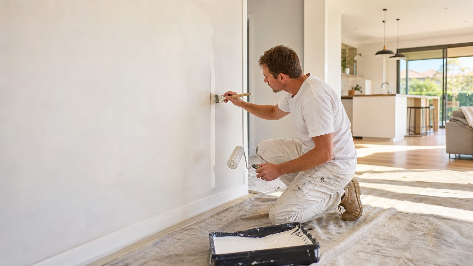
A room can use similar colours on walls, ceilings and trim without using the same paint. These surfaces have different performance and appearance requirements. Ask the painter to record the coating product and sheen for each one. If you want the same colour across them, inspect how that colour appears in the different finishes. A trim coating may reflect light differently from a flat ceiling paint. Matching the printed colour name therefore does not mean the surfaces will appear identical from every position in the room.
Decide how much contrast you want. A distinct white frame can outline doors and windows, while a closer match can make the junction quieter. Neither choice is a universal upgrade. Existing profiles, ceiling height, flooring and your preference affect the result. If the ceiling is staying, bring the proposed wall sample close to it as well as near the skirting. A new wall white may make the old ceiling seem darker or warmer by comparison. That observation should lead to a deliberate scope decision: retain the contrast, select another wall colour or include the ceiling. It should not become an unexpected addition once the wall painting is already complete.
Follow the sightline through connected rooms
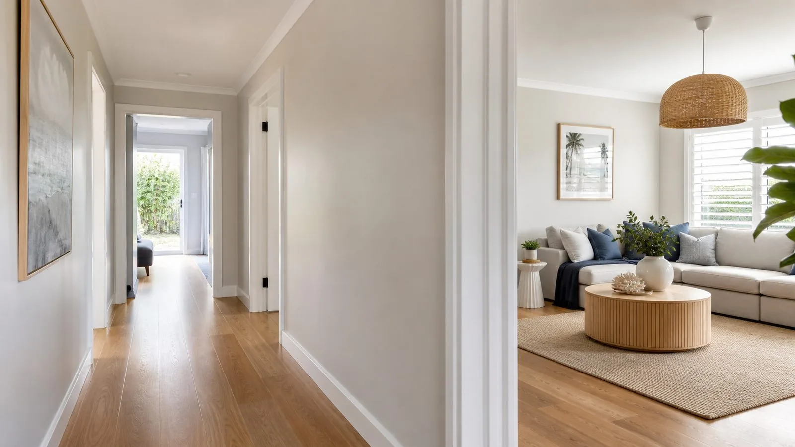
Open-plan rooms create a colour problem that individual sample squares do not solve. Stand at the entrance and look through the hallway into the kitchen and living area. Identify which walls belong to one continuous surface and which stop at genuine corners or doorways. If you propose different whites, mark their boundaries on a photograph. A colour change midway along a continuous wall needs a deliberate design reason and an agreed finish line. The edge of a rug or a sofa is not a lasting architectural boundary.
Consider a hypothetical Cardinia Lakes home with pale tiles in the kitchen and warmer timber furniture in the adjoining lounge. A candidate may suit one area better than the other. The owners could test a compromise white across the shared sightline, or choose separate colours where a real corner provides a clean break. This is a decision example, not a description of a completed job. The right question is which arrangement looks acceptable in both spaces during normal use. Adding a stronger feature colour may be another option, but it should solve a specific visual problem rather than distract from an unresolved mismatch between the fixed finishes and the main wall colour.
Avoid decisions made from an unreliable comparison
Choosing from a phone image is tempting because it is quick. The image, the display and the room lighting each change the comparison. Use online photographs to describe a general direction, then approve physical samples at home. Another mistake is choosing a colour before the final light fittings are installed. If the lighting will change, either test with the intended lamps or record the selection as provisional. Otherwise a paint change may be blamed for an effect created by the new lighting. Keep the variables visible instead of assuming the colour alone controls the room.
Do not treat bright white as a guaranteed cure for a dim room. Paint selection cannot create a new window or remove deep shade. Consider the existing lighting and the atmosphere you want, then assess candidates in that context. Also avoid approving only a freshly painted wet sample, comparing a dirty old wall to a pristine card without context, or allowing each family member to choose from a different set of samples. Agree on the actual shortlist, the viewing locations and the times for review. If people disagree, ask which specific condition fails for them. That produces a testable concern instead of an endless exchange of colour names.
Sign off a colour schedule that can be followed
Before material is ordered for the whole job, record the selected manufacturer, colour, code or formula, product and sheen for each surface. Identify feature walls, retained surfaces and any exceptions by room name. A marked floor plan or photograph is useful when two spaces share a wall. Ask who will check the first finished area against the approved sample and how any concern will be raised before the remaining rooms proceed. This is an approval step, not a promise that every surface will look identical in changing light.
Keep the physical sample and the written schedule through handover. A memorable colour name is not enough for future repairs if the product and sheen are lost. The comparison planner below turns your main fixed finish, lighting condition and room layout into a short test plan you can download. Add the actual candidate names to that plan when you discuss the work. It does not select a fashionable white on your behalf or simulate your room from a screen. It helps you decide where to put the samples, when to compare them and what must be recorded so the painter can apply the selection you have actually approved.